You may have already seen our Art Gallery for Primeval THULE, which contains a bunch of our production art and even some early concept art, but with this update we wanted to take you a little deeper into the art process, by showing some of the steps taken during the creation of our art.
Concept Art
Before we even launched the first Primeval THULE Kickstarter, we knew that we’d need to have illustrations made to be part of our pitch. So we put together a budget, and went hunting for artists that could help us out. Two of our artists, Klaus Pillon and Justin Mayhew, together created the bulk of our art. Justin was just starting out, and was recommended to us by a more established artist we’d talked to, while Klaus’s speed paintings that he’d posted to DeviantArt caught our eye.
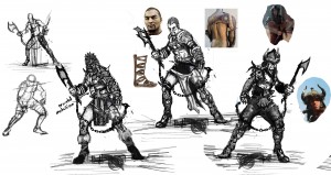
We used Justin to get us a number of black and white character sketches, to give a sense of what the people of THULE looked like. We gave him a detailed list of what we wanted to see, and he provided quick sketches for us, with options for things like poses or weapons. We provided feedback on what we felt looked the best, and from those early roughs, we ended up with a number of very solid black and white illustrations, and a couple of great color illos. We used these images to promote the first Kickstarter and set the tone for the types of things a traveler in THULE might see—heroes, villains, rakshasa, beastmen, serpentmen, and more all came to us through Justin.,
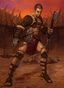
We liked them so much that once it came time to illustrate the Campaign Setting book, we had Justin revisit most of his pieces, adding color and backgrounds to the black-and-white images. This provided us images like the Katagian Pit FIghter that appeared in the book (and on the Katagia character reference card).
Landscapes
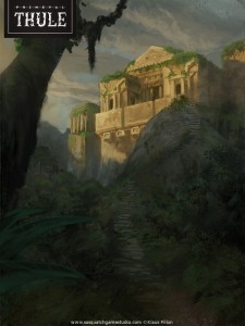
We wanted to make sure that both the concept art and the final book provided a window into the world of THULE.  The majestic glaciers, forbidding jungles, and cities of mystery are all a core part of the setting’s existence, and we wanted the reader to see as much of that strange new land as possible. Klaus Pillon did a fantastic job at providing many different looks at the landscapes of THULE.
The first glimpses we saw were color tests
and rough outlines, much like the image presented here. (click for a bigger view.) Klaus provided potential arrangements, and then even included some photos he used for color reference.
A short time later, we’d get a wonderful composition that fit the world of THULE perfectly. After getting a number of great, atmospheric illos for the concept art phase, we used Klaus’s art for nearly all of our landscape shots in the Primeval THULE book, as well as for the covers of our first THULE adventures!
Covering the Cover
For the cover, we knew we wanted to go big. From the beginning, we wanted the cover to be professional and from a recognizable artist, and our first choice for the job was Todd Lockwood, who we’d worked with before in our previous lives at WotC.
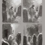
Before our Kickstarter campaign, we took a reasonably short journey to Todd’s house nearby, and spent an afternoon talking about THULE and the art process behind making the cover. He was very patient with us as he explained how we’d go from thumbnails to roughs and eventually to finals, as he showed us commissioned art in varying states of progress. Once we funded and brought him on board, he wasted no time in getting us some of his early ideas.
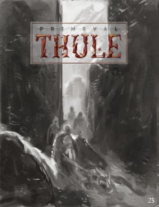
He focused on making the world foreboding and the heroes heroic, and since we knew the logo and title would take most of the top real estate, he provided layouts that could accommodate those elements. He went through dozens of quick iterations with the thumbnails and several roughs before we settled on the right layout, which looked like the image to the right. We selected this one out of perhaps a dozen similarly detailed others that had different levels of column height, or varying figure position, or other changes in composition.
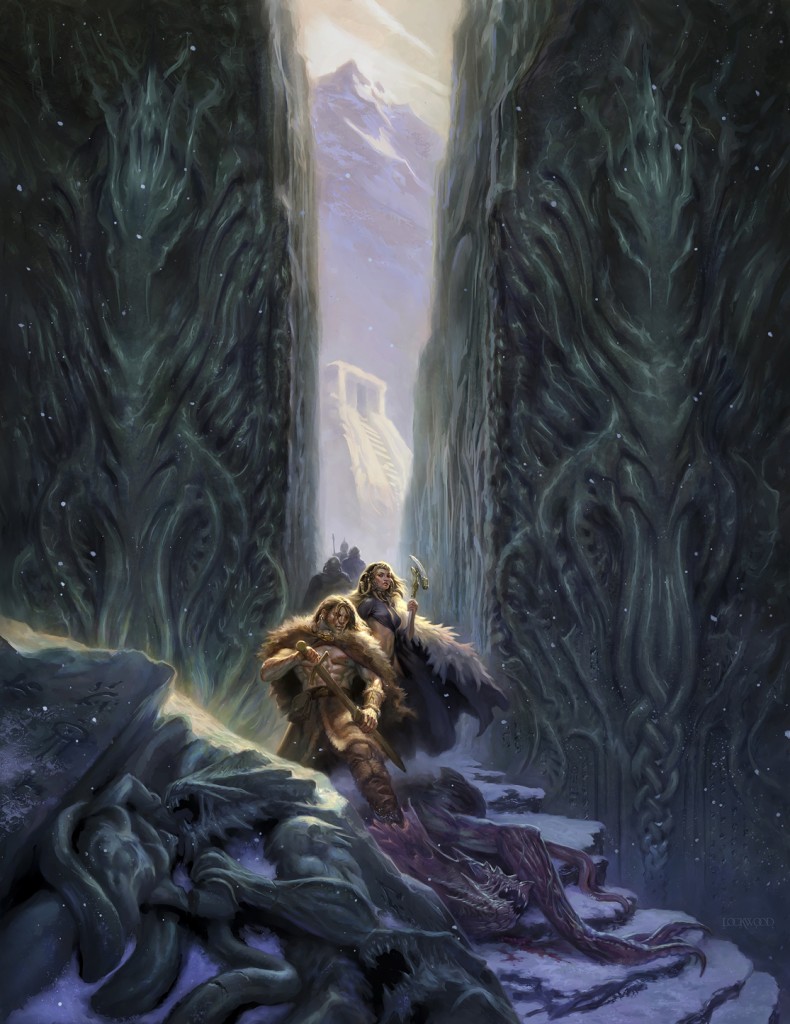
Finally, we had our cover art! We especially like the Giger-esque treatment of the columns, and Todd’s take on the star-spawn (originally concepted for us by Justin Mayhew). It looks great, and fits perfectly with the layout work done by Corey Macourek to get it properly bordered and incorporate the logo treatment.
We hope you’ve enjoyed this brief look at some of our art process for Primeval THULE. The final cover image is below — we have prints of this piece, signed by Todd, available as an add-on in our Thule 5e Kickstarter, which ends just a few days after this article goes live!


