We are totally excited about making Primeval Thule an awesome campaign setting, but we know the book needs to be more than just great words – we need great art to bring the world to life, to show the readers and the players glimpses of our vision of the world. To get the art we wanted, we needed to not only get great artists on board to illustrate the world, but we also needed to make sure that the artists share our vision and create illustrations that really show off the feel of Thule.
To give you an idea of some of the work involved, here’s a peek into the Process of the Art Order using a piece recently completed by Claudio Pozas. This particular illustration describes a scene in Quodeth, City of Thieves..
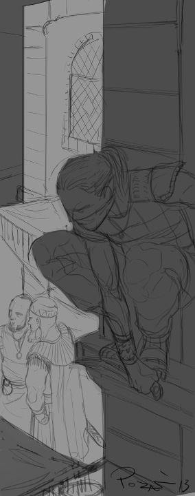
We start with the art order itself. These are instructions to the artist that describe the scene we are trying to convey. The artist will use this description, potentially along with our concept art and other reference images, to create the illustration. For this particular image, we sent the following instructions, and you can see Claudio’s initial sketch on the right.
City Assassin (0.5, vertical)
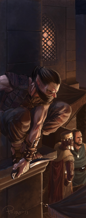
A male elf assassin clings to an ornamental balcony or stands on a narrow ledge on the second story of a building in a Thulean city. He’s looking down at a male human lord who’s striding by underneath him, seemingly unaware of the fact that an assassin is about to strike.
Setting: Lantern-lit city street. Thule is an ancient setting, not medieval, so the buildings might have a semi-Mediterranean or semi-Middle Eastern aesthetic and style. The buildings are made of brick covered with plaster, and the street is worn cobblestones.
Elf Assassin: Dressed in light leather armor and a tunic that leaves a lot of bare skin. A mask or cloth conceals the lower half of his face. He carries a curved dagger bare in one hand, since he’s about to strike.
Human Lord: Dark skin, African features. This guy is a nobleman from a militant city; he wears an ornate breastplate, a tunic that hangs to mid-thigh, greaves with decorations matching the breastplate, and a large cape pinned around his shoulders. He has a short sword in a scabbard at his hip. Don’t make him too Roman.
As you can see, we try to provide reasonably concise detail in the art order so the artist has enough to work with without being overloaded with text. And on our end of the process, we have to write those art orders in the first place, which can be quite laborious when you’ve got 70 or 80 individual pieces, each with a 200-word description. So it is a fine line between too brief/vague and too long.
Once we get the sketch, we might offer some suggestions on specific details that might need changing before final art. Sometimes we’ll go through a couple of iterations, or an artist might suggest a couple of directions, and eventually we’ll be ready for the final. The final of the City Assassin sketch is below. I’ll note that the resolution here has been down-rezzed significantly from the initial file, since there’s not much of a need for a 1900×4800 image on a typical website (we’ll keep the full-rez version for the print book).
Hope you enjoy this look at our art process, and we’ll have even more stuff to show off soon!


